
The Colour Wheel and how to use colour
the effect of light and the direction on colour.
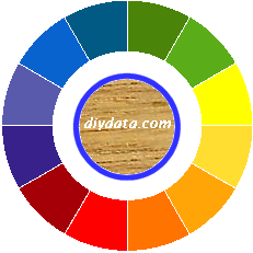
Modern thinking is that there are 4 basic colours, Blue, Red, Green and Yellow, and every other colour used in paint and other decorations are variations of these four (and also black and white which are not considered as colours).
Although our Colour Wheel has just 12 colours, the colours vary continuously around the wheel with millions of possible shades. Each colour is associated with a perception and their use can affect the way people feel and act - so the choice of colour in decorations needs to take into consideration the nature of the area being decorated.
- Blue - cold, of the sky and sea - relaxes, instils calmness and harmony. If used in large blocks, blue can make a room seem larger. Ideal for bedrooms and bathroom, not recommended for areas requiring stimulation or keeping awake, such as area for entertaining.
- Red - of anger and danger - stimulates and promotes activities. In large blocks it seems to advance towards you, so can seem to make rooms smaller. Ideal in areas of activity as it quickens the wits and stimulates - however it can be tiring for someone spending a lot of time surrounded by a lot of it. Not suitable where you need to relax such as bedrooms.
- Green - of nature - cleansing, instils contemplation. Ideal where you need to think such as in a study.
- Yellow - of happiness - brightens the mood, makes one laugh and smile, refreshing and promotes intellectual activities. It can make rooms seem smaller. Ideal where a 'bright' mood is required such as areas used for entertainment.
Using colours together.
There are three basic ways to combine colours using the Colour Wheel -
 |
All within a third. All the colours within a third of the wheel (that any 4 adjacent colours in our wheel) will work well together in harmony. |
 |
Separated by a third. Any 3 colours spaced equally around the wheel work well although - it is best to have one as a dominant colour with the other two being used to 'setoff' the effect. Such a colour scheme can give an exciting effect. |
 |
Two across. Any two colours across the wheel are complementary. With one colour used as the dominant scheme, the other colour will 'set off' the effect. |
The effect of light and the direction.
(Note, this page was written in the United Kingdom, so the following is strictly only relevant to similar latitudes in the northern hemisphere - remember this when you read it and, with a little bit of thought, you should be able to apply it to your location.)
Southern facing rooms receive the 'purest' light for most of the day, so the colours are seen as fairly true. In southern facing rooms, you can use almost any colour but remember that direct sunlight will make bright colours look brighter.
Eastern and western facing rooms have changing light. For an eastern window, the morning light is 'warm' and changes to a 'cold' light as the sun moves around the house. In westerns facing rooms, this is reversed with the 'cold' light in the morning and 'warm' light in the evening. East and west facing rooms can be more of a problem as the light changes with the time of day. The use of the room can have an effect - if it is used mainly in the morning, decorate an eastern room as for a south facing room or a western room as if it were a north facing room. Reverse this if the room is mainly used in the evening. If the room is used throughout the day, try a mix of warm and cold colours to complement the changing light.
Northern facing rooms tend to have 'cold' light all day, the advantage is that it is fairly constant throughout the day. In northern facing rooms, avoid cold colours, use bright and warm colours to counter the effect of the 'cold' light.
colour wheel - using colours together
the effect of light and the direction on colour.